This is a continuation of my series of posts to show you how to set up a blog. In this post I will show you how to adjust the Design Settings of the Genesis WordPress theme. Genesis is one of the most popular WordPress premium themes and use used by countless bloggers all over the world because its easy to alter how it looks without knowing any website coding, All it takes is just a click of a button. For the most part, this review of the Genesis Theme design settings won't be too hard to do.
For more information see my previous posts:
How to make your website step by step tutorial
How to install the Genesis WordPress Theme
How to adjust the Genesis Theme Settings
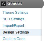
While at your WordPress Dashboard, click on Genesis and then Design Settings. You will see this menu:
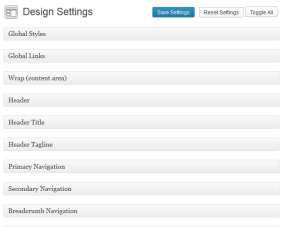
When you click on Design Settings, a big menu with many options appears:
The Genesis Design Settings menu lets you customize a lot of how the Genesis theme will look. We will only address some of the more important things here. Let's being by looking at Global Styles settings.
Global Styles
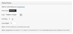
The Global Styles lets you pick the font and font color that the words of your blog will have. When you click on Global Styles, you'll see a menu like this:
I suggest leaving the font color as it is – black. It's easier on the eyes of your readers if you have black font on a white background. To change the color just click on the Font Color box.
Tip. If you are going to play around with colors, its smart to write down the number of the color before you change it. In the box above the color is “#222222.” This is the color black. There many colors. Writing down the color number will save you from getting lost.
As for the font you will use, I recommend you use either Arial or Verdana. These font's are “friendly” and easy to see on the screen. You can leave the font size as it is for now. Change it later if you feel it's necessary.
You can also customize the background of your blog. The background is the color around your website, not the color of where your blog posts are. By default, the background color around your website is gray. I recommend either a white background or a gray background. Again, the goal is to make your website easy on the eyes of your reader.
Global Links
The global links box tells the links on your website will look like. The normal link color that we are used to seeing is a blue hyperlink. As you can see in the box below, red is chosen.
What color should your links be? People debate this all the time! Obviously you want people to click on your links, so would it be better if the link stood out (as in having it red, as shown in the box above)? Maybe. Or is having it traditional blue be best? Maybe. There really is no perfect answer.
There are very popular websites that have red hyperlinks. For now, I say leave everything as it is now. Let's assume the people at StudioPress know what they're doing by keeping the link color red, and then maybe in a 3-6 months, experiment by changing it to blue to see if that increases the click through rate of your links.
Header
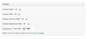
Your header is the text of what your website name is. For example on my website the header is “Golf Fitness Answers.”
In the Header box you can change the height, width and even background color of your website title. I recommend you leave everything in this box alone.
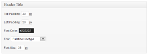
Header Title
In the Header Title box, you can change a lot also. You can change the font of the header and even the color of the header text. It's up to you what you do. I recommend leaving everything alone for now.
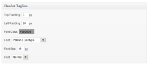
Header Tagline
In the Header Tagline box you can change how to tagline (the text just below the header) looks:
Other than maybe changing the font to either Verdana or Arial, I'd leave everything alone for now.
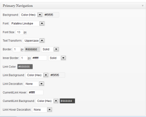
Primary Navigation
The Primary Navigation is the list of pages at the top of your website. Previously, we created pages called About and Contact. You may have created additional pages.
This window let's you change how those pages appear. Look them over and change what you like. If you are new to WordPress, I recommend leaving all this alone for now. You can always tweak this later if you like.
There is a LOT of other things you can change in the Genesis Design Settings but I don't think you need to worry about anything else here. My goal is getting your website up and running so you can start blogging now. As you learn more you can always come back and play around with the different parts of your new website.
Remember to click Save Settings before closing the Genesis Design Settings window.
Contact Page
I have not mentioned it yet but you are going to want to add contact information to your Contact page. Do not just type in your email address on your contact page because that will cause you to get lots of spam. Fortunately, there is a free WordPress Plugin that I recommend called Contact Form 7. Here is a Youtube Video on how to install and use Contact Form 7. Much thanks to WordPressJunkie for this video! Watch the video and follow along and you will have it installed in about 5 minutes.
You are now done tweaking the Genesis WordPress Theme. If you notice, there is also SEO Settings in the Genesis Theme. SEO Stands for Search Engine Optimization. That's fancy talk for how do we get the search engines (like Google) to notice our website – and hopefully rank us on the first page. I recommend not changing the SEO settings in Genesis. The best SEO tip I can give you is think like your readers – answer their questions and help them solve their problems. If you do this, you will naturally write a better blog. Google and other search engines will then reward you by putting you at or near the top of their search pages.
What do you think?


Leave a Reply